

Summary
Craft is an app intended to make it easier to discover new hobbies through access to unique experiences and communities. Hobbies are shown to increase quality of life and satisfaction; however, getting started can be difficult. Craft allows users to explore diverse options, try new experiences, and connect with others all in one app.
The Challenge
Even though there are known benefits to having hobbies, users often feel overwhelmed at the prospect of finding and maintaining new hobbies. Many factors such as cost, time commitment, accessibility, and lack of consolidated resources are common hindrances. In the midst of already busy lifestyles, users need lower barriers to entry in order to efficiently pursue hobbies.
The Solution
With Craft, the desire is to create a platform that makes it easy to find engaging hobbies to fuel users’ passions and interests. It includes features such as a robust database of quality experiences, consolidated information, in-depth search by location and categories, easy sign up, and community building. Creating a space for users to explore and grow without the hassle.
Project Details
Duration: 4 months
Role: UX/UI Designer
Tools: Figma, FigJam, Miro


DISCOVERY
Secondary Research
For my secondary research, I focused on the difficulty of finding and maintaining hobbies. I found in numerous studies that individuals with regular leisure activities and hobbies have increased life satisfaction and better physical and psychological well-being. However, people often struggle with finding time for hobbies, being able to maintain them, and choosing a hobby based on their personal enjoyment rather than social expectations.
Primary Research
My objective was to understand the barriers to entry people experience when attempting to establish a new hobby, and the factors – both tangible and intangible – needed to maintain a hobby. I created a research plan, used a screener survey to recruit five participants, and interviewed them remotely. Afterwards, I synthesized the data into affinity groups, empathy maps, and created subsequent personas.


Interviews
Using the screener survey, I recruited five participants to interview remotely over Zoom. During the interviews, I asked questions regarding their current hobbies and their interest in new hobbies. I focused on how they felt when participating in hobbies, what drew them to specific hobbies, what hindered them from trying new ones, resources they would like to have, motivating factors for hobbies.
Affinity Maps
After interviewing the participants, I created affinity maps which allowed me to group my findings into six key categories. This provided insight into the barriers to entry and factors needed to maintain hobbies. By consolidating the data into these categories, I was able to hone in on the users’ top-level needs and concerns that could potentially be solved through my app.
Empathy Maps
The affinity map then further categorized into two empathy maps: The Enthusiast and The Young Professional. It helped me to build a deeper understanding of the users’ goals, behaviors, pain points, and thoughts. Also, this exercise helped me to think through the main functions I would want to include on the app to address these needs.


Personas
The empathy maps were further built into two personas: Elizabeth the Young Professional and Jenny the Enthusiast. By creating the personas, I was able to form two specific types of users that would be in the ideal target market for my app. This would then inform how I design the app in order to be useful and effective for users like Jenny and Elizabeth.


IDEATION
Problem Statements
How Might We’s
After synthesizing my findings, I developed HMW questions to ensure that I was addressing the users’ central pain points when beginning the ideation and design phases.
How might we support users to find new hobbies they enjoy?
How might we help users feel confident in their progress and productivity?
How might we guide users to manage their time and money efficiently?
How might we enhance their connection to the hobby community?
Ideation Sketches/Brainstorm
To begin the ideation phase, I brainstormed eight different ideas that could address and solve for the HMW questions. I wanted to create ideas that would allow users to choose their hobby preferences, feel progress, manage their resources well, and be connected to a community. I drew inspiration from other apps like ClassPass, Reddit, and Apple Calendar.
User Stories
To determine the key functions of the app, I created users stories in order of high to low priority. This allowed me to hone in on the essential elements that users would need to have their needs successfully met with the app.
(High Priority) As a user, I want to
Browse through all of the available classes so that I view classes outside of my suggestions
View classes on a map so that I can find the locations that work best for me
View class descriptions/information so that I know what I am signing up for and what I need
Rate and review classes so that I can share my opinions and read other users’ reviews
Create an account so that I am able to use the platform
Site Map
With the user stories, I was able to create a high-level sitemap that organized the essential functions and structure of the app. This helped me to establish the four main paths that a user could experience on Craft.
Userflows
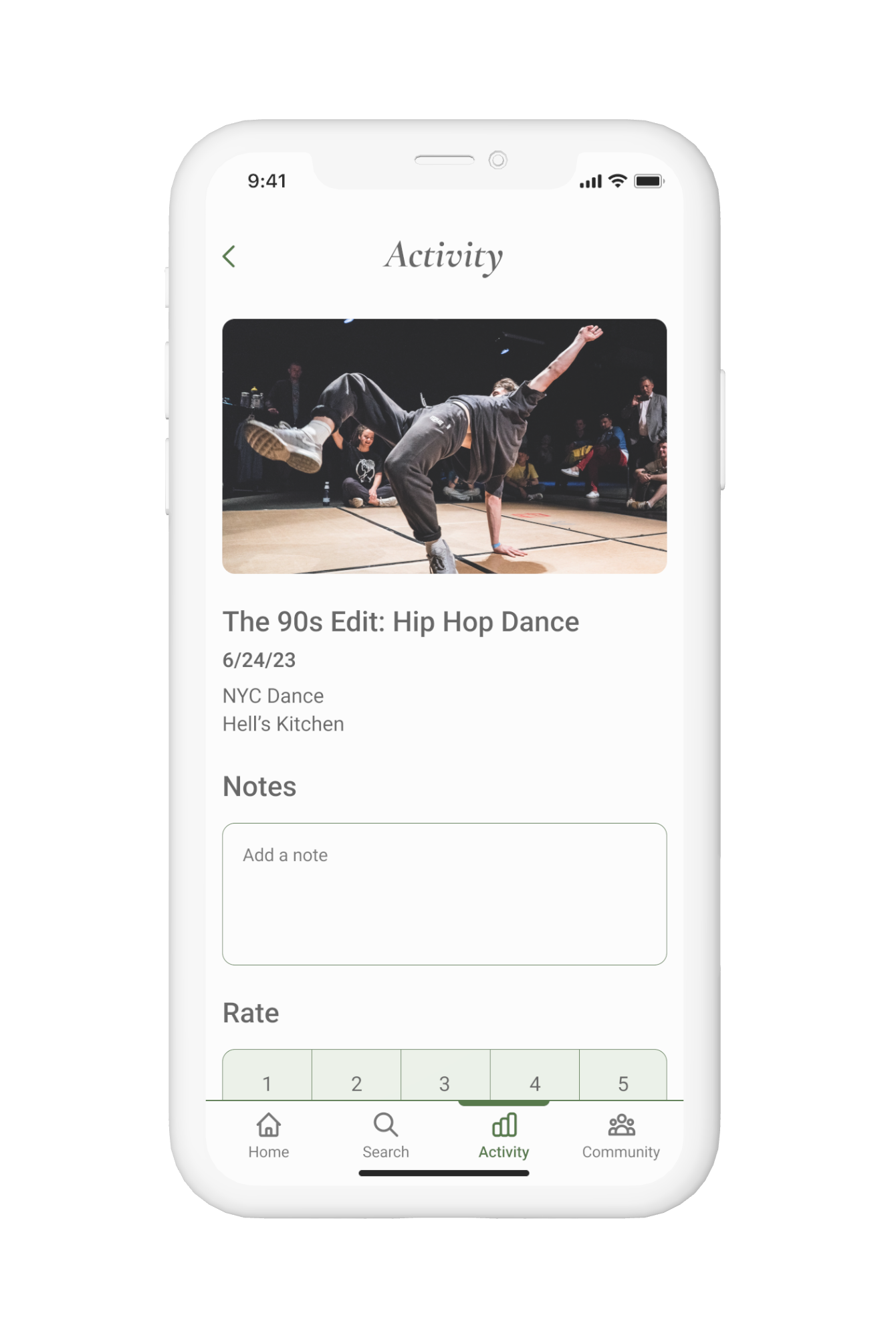
With the user stories and sitemap, I created user flows to figure out how a user would complete three main functions of the app: signing up for a class, commenting on a community thread, and logging your class experience and progress. It allowed me to see what screens I would need to build for each step through the users’ experience.
Sketches
To round out the ideation phase, I sketched out the three user flows. Sketching helped me to bring the user flows to life and create a foundation to build off of when designing the app.


DESIGN
To begin the design phase, I built out the sketches in Figma to create low and medium fidelity wireframes. Iterating with wireframes allowed me to focus on how I wanted to lay out the app’s functions and how it would look in context.
Wireframes


Moodboard and
Brand Platform
After the initial wireframes, I took time to create the brand platform and a moodboard for the app. The brand platform helped me to think through the company name, mission and vision, brand personality, and brand attributes as guiding principles.
Craft: I chose this company name because I want users to feel like they can find their niche and hone in on the skills and community through the using the app. Also, it wanted the name to be short and catchy for people to remember.
Mission/Vision: Discover new hobbies to fuel your passions and interests. We make it easy to find unique experiences and communities to enhance your life.
The moodboard allowed me to gather ideas for the look and feel of the app. I wanted to express the high quality nature of the app so I looked for macro-style photography and images that created movement. With the UI style, I wanted the app to feel polished and modern so I leaned toward inspiration that was bright, had soft/neutral colors, and created an inviting atmosphere.
Style Guide
To further inform the design of the app, I created a style guide to help establish a design aesthetic and maintain consistency. I chose subdued, earthy tones to bring a grounding and calming feel to the app. Also, I used the forest green as my primary color to bring brightness to the earth tones and to encourage growth and improvement. I chose a serif font to create an atmosphere of sophistication and invoke the feeling of high quality experiences.
High Fidelity Screens
After defining the look and feel of the brand, I was able to create high fidelity wireframes. I implemented the fonts, typescale, colors, and icons from the style guide as well as the imagery and app style from the mood board. Also, I adjusted the layout and spacing for a smooth user experience through the flows. Creating the high fidelity wireframes brought the app to life and allowed for the design to be tested.


Prototype
Using Figma, I was able to link the frames together to build a working prototype of the user flows. This helped to put the app to the test and determine the level of intuitiveness and usability.
TEST
Usability Testing
I created a usability testing research plan with the objective of finding any issues that would not allow users to effectively and efficiently use the app for their hobby discovery journey. Also, to identify any improvements or additions for future iterations.
I recruited five participants through my personal network. Then, I conducted the moderated remote testing over Zoom. There were three tasks for the participants to complete:
Sign up for a class
Add a comment to a community thread
Add notes on their completed activities
Findings and Recommendations
In my findings, there were three main usability issues
Not enough class information was available prior to signing up
Not evident that the notes section was private, assumed to be public
Overall function and layout of the community section was not clear
My recommendations to improve on these issues
Update the search results cards and class information pages with more information such as instructor info, class size, website info, level description etc.
Update the copy to indicate privacy (e.g. My Notes), create a public review section on the class information pages
Create a section for friends/sharing, add CTA to create threads
Redesign
My findings from the usability testing greatly informed the redesign process. The participants were able to indicate areas of improvement to create a smoother and more intuitive experience.
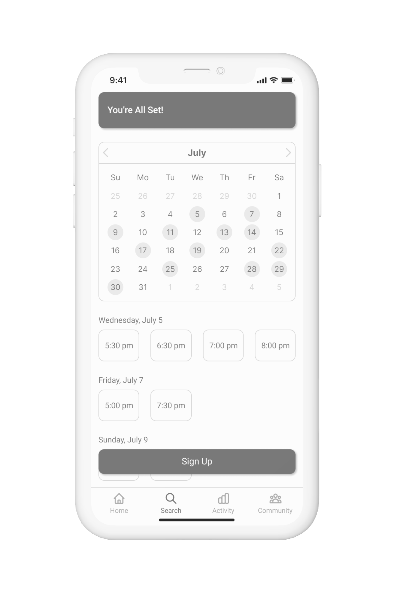
Critical Issue 1
There was not enough class information available prior to signing up. To address this, I added significantly more information like the number of available spots left, instructor name and title, class level explanation, star rating, and reviews so that users would have a better idea of what they were signing up for.
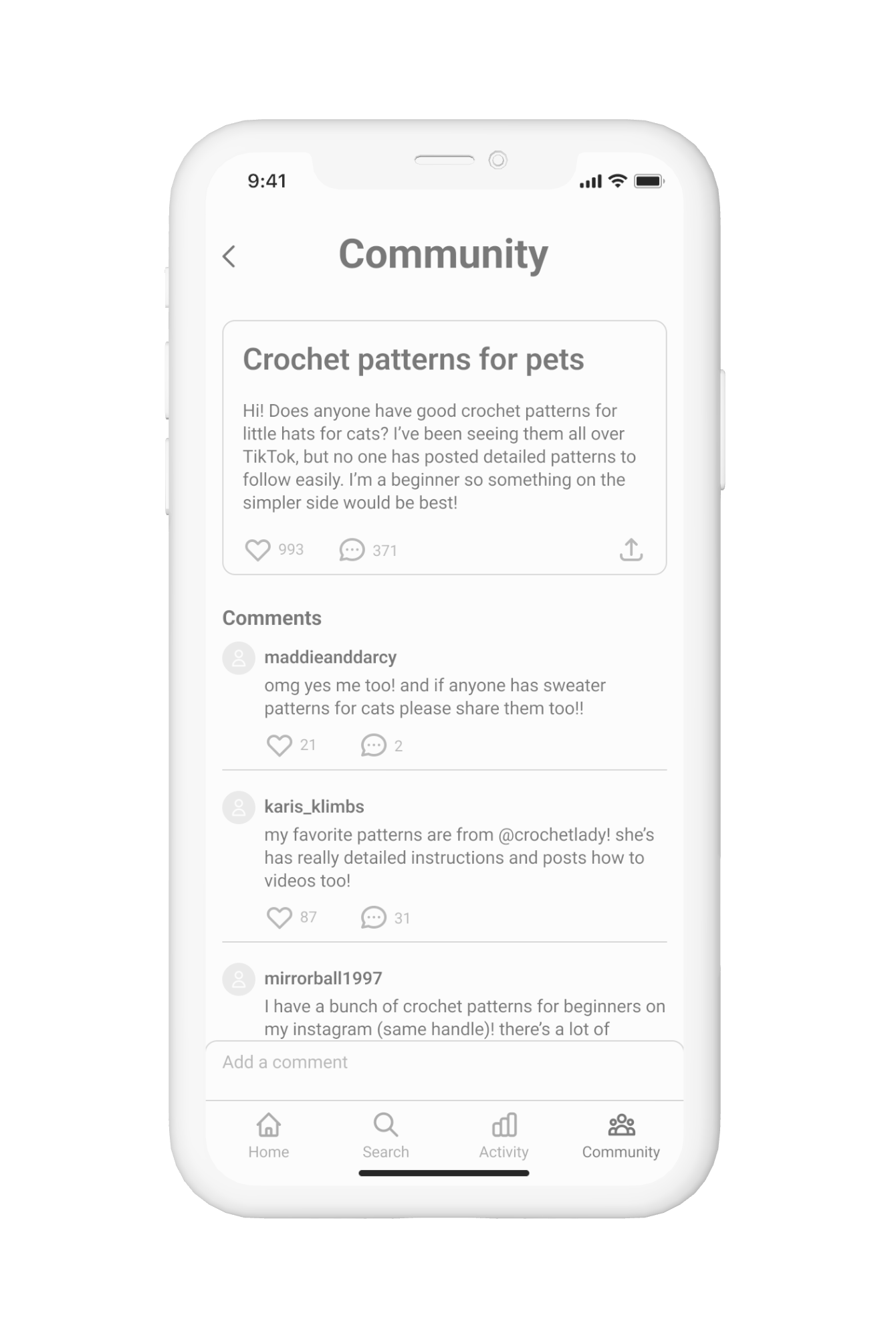
Critical Issue 2
The overall function and layout of the community section was not clear. Test participants thought they would be able to communicate with friends and add posts. To address this, I added a section for users to see their friends and add more. Also, I added a Post button so that users could contribute to the community easily.
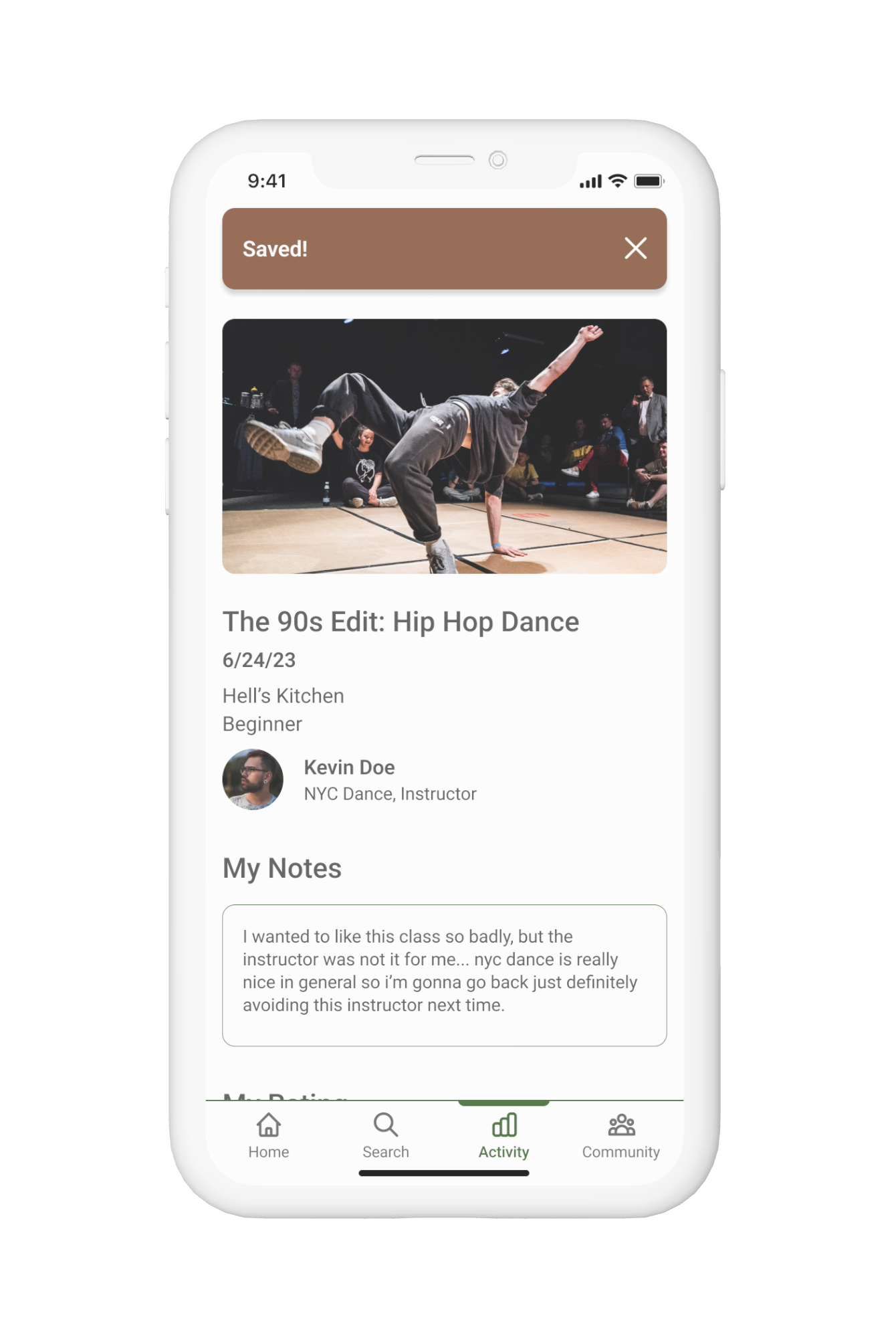
Critical Issue 3
It was not evident that the notes section was private. The test participants assumed that the section was public. To address this, I updated the copy to “My Notes” and also added the public review section to the class information pages so that there would be greater differentiation.
Reflection
Overall, this project gave me a greater understanding and working knowledge of the UX/UI process from research to design.
A challenge and point of growth for me was designing for a mobile app rather than static materials that I was accustomed to as a graphic designer. It was exciting to be able to create a dynamic and interactive experience.
Also, a key takeaway was the importance of testing and receiving input from outside sources. The interviews and usability testing were instrumental in improving the usability of my app and providing insight that I was not able to identify on my own.